
BEYOND THE HEADSHOTS PREPARATION GUIDE
This guide was developed to help answer most commonly asked questions, ensure your professional portraits experience is enjoyable and that you get the most out of your time with us. It reflects years of experience and lessons learned and it meant to be a guide that leaves your feeling prepared and confident.
Prior to coming in for your session, it is recommended that you consider how you would like your images to represent you and what message you wish to convey. Not all professional portraits are created equal and we strive to bring out a true and authentic aspect to each person we photograph.
Depending on the culture of your company, personal brand you may want to convey an air of formality, knowledge, and trust. Or, maybe the look you want is more creative, friendly and less formal! Your headshot session should be a reflection of you in your best light. You want to dress as if you are meeting with your finest client, a leader you look up to, or if you’re an actor, a casting director.
Impactful professional images in our view go beyond the physical appearance and are in fact more about expression and character. The energy you portray and how you carry yourself. Your wardrobe is a reflection of your style, your role, authority and should be a complement to your personal and or business brand.


CONSIDER HOW YOU WILL BE USING YOUR IMAGES
When it comes to headshots and branding there are so many different ways in which your images could be used. Is your intent to use your images for Linkedin, business website, social media profiles such as Facebook, Instagram; is it for speaking engagements, blog posts, book covers, press releases, newspapers, billboards, print materials and brochures, business cards? What are the different ways you might use your headshots now and how might they be used in 6 months or 12 months time. The different uses might require different wardrobe considerations and photography compositions/framing/image orientation to best serve the platform or audience you have.
With that in mind, how many images will you need? Do you require just one pose (classic crop at mid chest) or do you desire some variation in your poses, different body lengths and crops, different background choices etc. Some clients require images that leave enough negative space and room for messaging or branding to be added? These are the sort of questions that will help you with making the most out of your photoshoot session, ensuring you have the images you need now but also those that will serve you over the next year

COLOUR THEORY
Research has shown certain colors can have a psychological impact on our behavior and feelings, and if worn in moderation, can help you subconsciously influence what you want people to think or feel about you.
Here are some psychological characteristics associated with common colors:
Black: Formal, sophisticated, powerful, and elegant. Use in moderation as this is the most formal colour and pair with other tones and colours.
Gray: A neutral color that is a great base to pair with other colors. Gray alone can come across as low energy, too safe or boring.
White: Purity, innocence, cleanliness, and simplicity. White draws attention and is a stark contrast for other tones. White on white (White wardrobe on white background) is a minimalistic, super sleek and attention stopping combination
Yellow: Cheerful and evokes friendliness and optimism. Should be used in moderation as it can be overpowering if too vibrant.
Orange: Possesses the energy of red without the seriousness. Orange is associated with fun, ambition, and enthusiasm.
Red: Draws attention and creates a visual impact. It evokes strength, power, and is persuasive, but may also come off as assertive or aggressive. Bright red ties are commonly known as the classic power tie, popular for its psychological influence.
Blue: The safest colour and most popular among both men and women. Blue is a calming colour associated with intelligence, focus, loyalty, and trustworthiness. Navy blues suggest more power and authority than lighter blues.
Green: A relaxing colour associated with nature, balance, generosity, connection and peace. Dark green is associated with wealth.
Purple: The color of royalty. Purple evokes wealth, luxury, sophistication, mystery, and wisdom. Use in moderation.
Pink: A soothing color seen as innocent on women. Men who wear pink are seen as bold, assertive, in control and confident.
TEXTURE IS KING
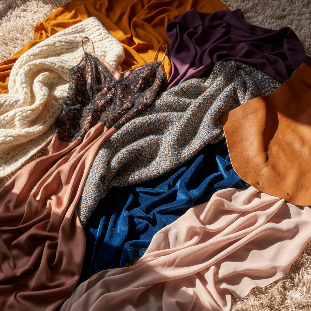
Texture adds depth, interest, structure and quiet sophistication to your look - the kind that reads effortlessly polished on camera. Subtle dimension in fabric can create warmth and approachability, softness or power and assurance, while elevating even the simplest silhouette.
Think of fabrics such as wool, tweed, silk, chiffon, velvet, linen, suede, leather, fur, satin, lace, or richly woven cottons like Oxford cloth and fine knits. These materials photograph beautifully, adding visual interest without overpowering your presence.
A textured layer - a blazer, a soft knit, a silk blouse, or a beautifully woven accessory - can instantly elevate an otherwise clean, minimal outfit.
Traditionally, more structured or coarse fabrics are perceived as stronger and more tailored, while softer, fluid fabrics feel romantic and refined. Thoughtfully mixing the two allows you to shape the tone of your look - softening sharp lines or adding structure to something more fluid.
You’ll find texture in blazers and sport coats, blouses and shirts, sweaters, ties, skirts, and subtle accessories like jewelry, pocket squares and scarves. These small choices make a big difference in how your portrait feels - timeless, dimensional, and intentionally styled.
WARDROBE
CONSIDERATIONS
01
ARCHITECTURE & FIT
The camera translates three dimensions into two; therefore, the "architecture" of your clothing is paramount.
Tailored Precision: Select garments that are expertly fitted. While comfort is key, overly loose fabrics can lose their shape on camera. Pieces that define the waist or follow the natural lines of the shoulders create a polished, intentional silhouette.
The Power of Sleeves: For a timeless look, we recommend long or three-quarter sleeves. This draws the viewer's focus upward toward your face and creates a clean, continuous line from shoulder to hand.
Intentional Necklines: High-set necklines -such as crew, jewel, or boat necks - provide the most versatile frame for a headshot. Deep necklines may be lost in closer crops, whereas a structured collar adds an immediate sense of authority.
02
THE ART OF COLOUR
Color should complement, never compete. The right palette brings clarity to your skin, brightness to your eyes, and a natural sense of balance to your overall look. The wrong one can cast shadows, exaggerate redness, or flatten your features on camera.
The "Eye" Method: One of the most effective ways to choose a shirt or tie is to match the color of your irises. This creates an immediate, subconscious connection with the viewer.
A Stylist’s Shortcut
One of the simplest professional tricks is choosing colours that echo your iris tones.
Blue eyes → navy, slate, soft denim
Green eyes → olive, moss, forest
Hazel eyes → camel, warm taupe, muted teal
Brown eyes → chocolate, espresso, wine, soft charcoal
This creates an immediate and subconscious visual harmony, drawing attention exactly where it belongs - your face & expression
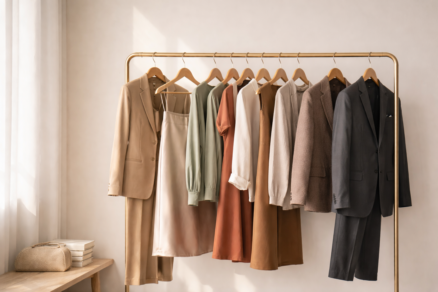
Timeless Neutrals: For suiting, charcoal, navy, and deep chocolate offer a sophisticated foundation. A well-tailored blue suit remains the gold standard for a modern, sharp aesthetic.
Navy – universally flattering, strong but approachable
Charcoal – refined, modern, excellent for leadership portraits
Deep chocolate – rich, elegant alternative to black
A well-tailored blue suit remains the gold standard for modern professional imagery, offering contrast without harshness and adapting beautifully across skin tones.
03
REFINED DETAILS
Luxury is found in the details that most people overlook.
Texture Over Pattern: While busy prints can distract and "moiré" (flicker) on digital screens, rich textures like wool, silk, or heavy linen add sophisticated depth.
Contrast & Depth: Aim for contrast between your layers. A dark jacket over a lighter silk blouse or a crisp white shirt creates a visual "pop" that feels high-end and energetic.
Impeccable Grooming: Ensure all garments are professionally pressed. The camera lens is unforgiving with wrinkles, lint and pet hair. Likewise, ensure undergarments are chosen strategically to remain entirely invisible, maintaining the seamless flow of your outfit.
02
THE ART OF COLOUR - IN DEPTH LOOK
Professional stylists recommend you begin with the main undertone, not hair colour or surface complexion. Undertone is the subtle hue beneath your skin that does not change with sun exposure or seasons.
There are three primary undertone families: Cool, Warm, and Neutral.
Cool undertones
Characterized by hints of blue, pink, or red beneath the skin.
You may lean cool if:
Silver jewelry feels more flattering than gold
Your veins appear more blue or purple
You flush pink easily
Cool-toned hair colours (ash blonde, cool brunette, black) feel harmonious
Best colours:
Navy, charcoal, slate, cobalt
Soft blush, dusty rose, berry
True white rather than cream
Avoid:
Mustard, rust, camel, warm beige
Orange-based reds
Warm undertones
reflect golden, peach, or yellow hues beneath the skin.
You may lean warm if:
Gold jewelry enhances your skin more than silver
Your veins appear more green than blue
Earth tones make you look healthy and radiant
Warm hair colours (honey blonde, copper, chestnut) suit you well
Best colours:
Olive, camel, chocolate, warm taupe
Coral, terracotta, peach
Cream instead of stark white
Avoid:
Icy pastels, cool greys, blue-based pinks
Stark black near the face
Neutral undertones
Sit beautifully between warm and cool, allowing for the widest range of colours.
You may lean neutral if:
Both gold and silver jewelry look equally good
Your veins appear both blue and green
You can wear both warm and cool shades without contrast issues
Best colours:
Soft whites, greige, espresso, soft navy
Muted jewel tones
Balanced blush and rose tones
Neutral clients benefit most from intensity control — avoiding extremes in brightness, contrast, or saturation.
THe nuance of Pattern
While solid colours provide a classic foundation, patterns offer a sophisticated avenue for personal expression. When executed with intention, they add depth and character without compromising the professional focus of your portrait.
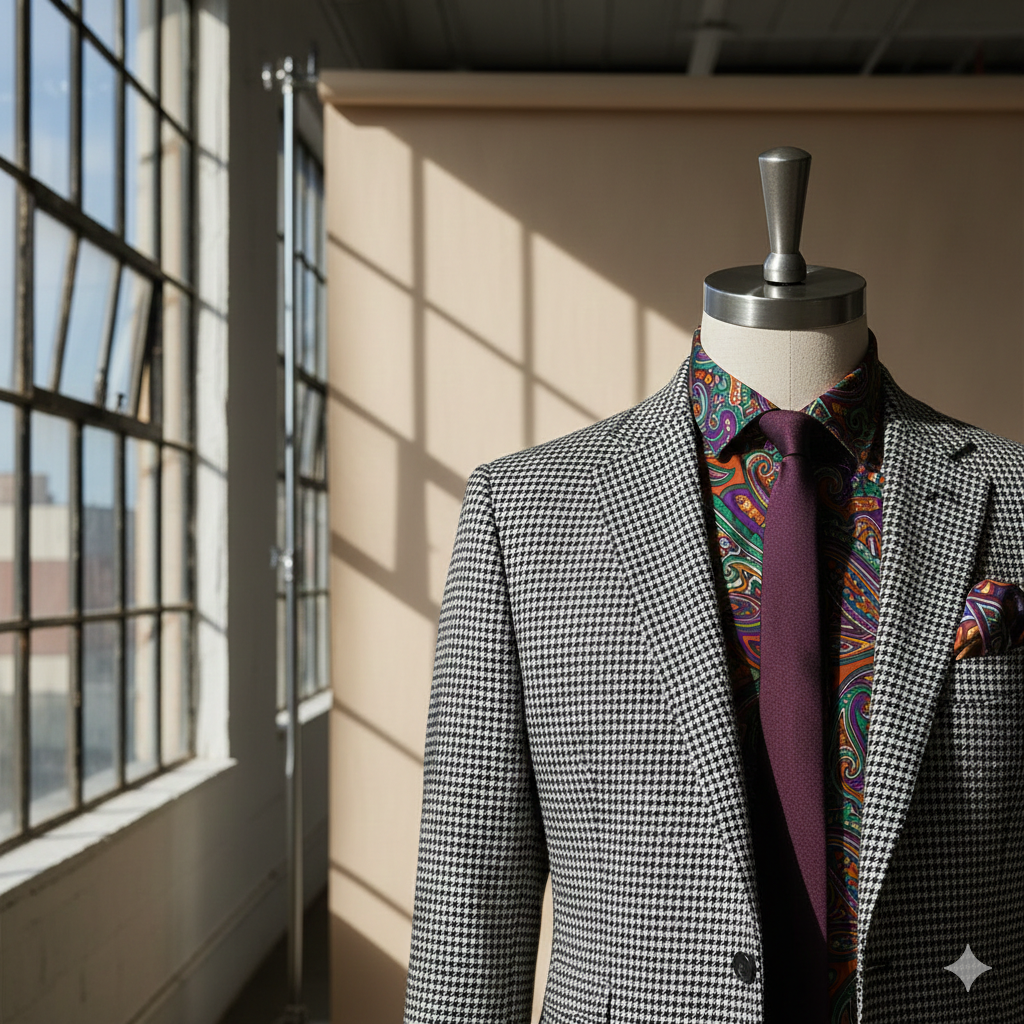
Scale and Density: Favor "micro-patterns"- small, dense, and repeating designs. From a distance, these read as a rich texture rather than a distracting graphic, ensuring the viewer’s eye remains firmly on your expression.
Strategic Layering: Patterns are most effective when "framed." Consider a patterned silk camisole beneath a structured blazer, or a subtle pinstripe shirt softened by a solid-toned jacket. This layering adds a dimension of luxury while maintaining visual order.
The Art of the Pinstripe: For those seeking a streamlined silhouette, pinstripe jackets and shirts offer a lengthening, slimming effect that translates beautifully on camera.
A Rule of Two: To maintain a cohesive aesthetic, we recommend mixing no more than two patterns within a single look. The key to successful pairing is a variation in scale; if your shirt features a fine micro-check, your tie or pocket square should feature a larger, bolder motif.
Accessories as Accents: For a truly elevated look, we often suggest solid-colored ties to keep the focus on the face. However, a refined pocket square or a patterned scarf can serve as the perfect "signature" piece to reflect your personality in a subtle, unobtrusive way.
CURATION OF ACCESSORIES
Accessories are the final layer of your personal brand - a subtle opportunity to infuse your portrait with personality and timeless elegance.
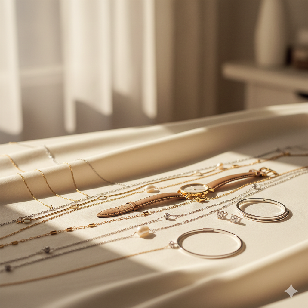
The Principle of Simplicity: We recommend selecting pieces that enhance rather than command. A classic timepiece, a refined necklace, or modest earrings provide a sense of completion, ensuring the primary focus remains on your eyes and expression.
Timeless Over Trend: To ensure your portraits remain relevant and don’t quickly date, lean toward classic designs. While statement pieces are beautiful in a fashion context, they can date an image as trends evolve. Opt for precious metals and clean lines that possess an enduring quality.
Proportional Placement: Consider the geometry of your jewelry in relation to the camera's crop. We suggest necklaces that rest near the collarbone; longer pendants can often fall below the frame, creating a visual "lead" that draws the viewer’s eye away from your face and out of the frame.
Material & Palette: To maintain a luxury aesthetic, avoid bold or overly saturated "costume" colors in your jewelry. Instead, let the natural luster of gold, silver, or pearls complement your skin’s undertone and the textures of your wardrobe.

MAKEUP
Makeup can singlehandedly make or break an image. Most people are not well versed in matching makeup to their skin tones correctly, applying powder properly, selecting the right colours, blending or applying highlight/contour optimally. Overall, we recommend not over-doing it and going more for a natural look.
We strongly advise getting your makeup professionally done to get the most out of your images. If this is not an option however, we have included many tips below for doing your own makeup.
-
We work with the best makeup artists in the city who understand what photographs well and who understand our work. This ensures that colours, tones and makeup are flattering, age appropriate and translate well on our high definition cameras. Rate for in-studio hair and makeup services right before your photography session are $320+gst or makeup only for $200+gst.
-
Our images are all professionally retouched for removal of blemishes and stray hairs, correcting complexion and minor skin discolourations, reducing shine and the like. Having appropriate makeup however is a key and a critical foundation that ensures optimal retouching can be achieved after the fact.
If you are doing your own makeup, here are some key considerations to be mindful of:
Photography requires professional studio lighting similar to the lighting used for professional video. Shine on the face/nose/forehead, excessive makeup highlighting/contouring can be particularly unforgiving on camera. Also be mindful of skin discolouration and any redness from too much sun or skincare treatments
The skin tone of your face foundation should match the skin tone of your neck
Matte foundation and translucent powder are recommended to ensure even skin tone and reduce any shine. Matte makeup is also universally flattering on more mature skin.
Darker under eye/waterline makeup around the eye can make the eyes look smaller and more tired whereas lighter tones around the eyes can make them appear larger, brighter and more open.
Matte eye shadows/blush and lipstick are often best and most flattering on most skin tones, ages. Avoid anything with glitter, shimmer or overly bold, punchy and vibrant tones as they tend to highlight imperfections, natural skin texture and reflect light too much
Do not apply overly shimmery or coarse highlighter or dark bronzer/contour unless you know how to blend these products very well
Please bring your makeup with you to your session for any required touch-ups.

HAIR STYLING
How your hair is styled can have a huge effect on whether you love your headshot. You are free to find and select your own stylist if needed or you have the option of adding on professional hair/makeup services as part of your session through us.
We work with some of the best artists in the city, they know our style, preferences and approach ensuring optimal results. They also come directly to our studio on the day of your session, making it a more relaxing and stress free experience.
-
We offer professional hair and makeup styling with our preferred artists who come directly to she studio on the day of your session. Hair and makeup services can be booked in advance of your session for $320+gst for both services. We currently do not provide hair only services. Alternatively you can contact the artist directly as they may have a preferred rate for clients coming to their premises.
-
Clean Hair – if you aren’t doing a blowout, wash your hair the day before the session. Day old hair will typically be more cooperative in styling than freshly washed one.
Flyaways and frizz – Most flyaways can be addressed with hair spray, anti-frizz, anti static or styling cream. .We have hair spray in our studio for touch-ups.
Haircut and color lead time – If you get your hair cut or coloured and are due for a touchup, please schedule your appointment about 7 days before the session. Our high definition cameras catch the smallest details, if you don’t wish to have your regrowth or grey roots showing a refresh would be a great option. Keep in mind this is not the time for drastic changes.
Deep Condition: most salons can do a deep conditioning (or gloss treatment) or you can use your favourite deep conditioner or hair mask at home to refresh dry hair and smooth hair follicles for optimal hair styling and minimal frizz.
Volume – Volume is always preferred. Volume adds flattering dimension and life to image. Fresh blow-dry/blow-out, soft waves or curls. The intent is always natural looking and nothing that looks overdone or too rigid.
Blowout – if you are doing a blowout it’s recommended you do it the same day as your session. Please note: we do not offer blowouts in our studio
Natural – Whether you style your hair yourself or work with a professional, we do not recommend trying a new hairstyle on the day of your session. You want to be the best version of yourself, however you don’t want any major surprise factor when people see your headshots - unless of course that is the precise purpose.
Hair up – Pulling the hair back and or away from the neck tends to slim down the face and elongate the neck. This also opens your face more for your headshot to stand out.
Hair that sweeps across the forehead will make the forehead appear smaller in an image, examples could be side fringe or curtain bangs. Ex. If your face is already petite and narrow, having bangs that cover the forehead may make it appear even smaller.
Partially straight hair with a curl outwards from the face on either side will frame the face nicely and help create a nicely put together look. You can always tuck one side behind your ear to frame the face as well.


SKINCARE & BEAUTY CONSIDERATIONS
-
No facial treatments (chemical peels, lasers, injections, etc.) for 10 days prior to the session.
Waxing treatments - If you need to wax any hair on your face including your eyebrows, try to make the appointment the week before your headshot. Skin can be very sensitive and can stay red in the waxed areas for a few days depending on the individual. AVOID waxing the day before or the day of your headshot.
If you usually get a spray tan or use tanning lotions or solutions we strongly recommend you skip them until after your session. Tanning products of any kind do not translate well on camera!
Exfoliate - Just as any skincare facials or treatments on the face, exfoliation should be done at least a few days before your headshot to avoid redness of the skin. Ensure you also exfoliate your body, arms, hands, neck, elbows as it helps greatly in removing any dry, unwanted layers of skin.
This applies to men also and is key to ensure you don't have any dry patches on your skin in your images. Dry, flaky and/or irritated skin is quite challenging to fully remove in post processing.
Moisturize - We live in an incredibly dry climate. Ensure that you moisturize any and all exposed parts of your skin very well the week leading up to your session.
-
Don't forget to think about your nails, if you're not a nail polish person and for men as well, simply ensure they are clean and tidy before your photoshoot.
Manicured nails or clean nails with neutral colour are best. Avoid busy patterns, designs or any bold or neon colors. Hands are used a lot in portraits however we often incorporate them in headshots also depending on client desires, intended us and various body crops we will be doing. Nails should compliment your style and wardrobe choices versus being distracting and taking attention away from your face.
-
Stay hydrated - Drink plenty of water the week of your headshot. Try to avoid sugary or overly salty foods and pop drinks.
-
Freshly groomed facial hair can really create a professional look. This doesn't necessarily mean a clean shave though (unless that is what you do), just more of a really great tidy up to create clean lines. If you aren't someone who does this regularly yourself or you don't have the right tools, many barbers will offer this as a service or add-on to your hair cut!
WHAT NOT TO WEAR
-

Neon / Nude or Stark White Colors
Stay away from neon shades of color since light reflects off your clothing and onto your skin, and can create unnatural color casts on your skin. Also avoid flesh toned clothing, because the color can blend into your skin tone too well, risking the appearance of not wearing any top and not providing enough contrast.
Avoid pure white as it reflects 100% of light in photographs, making your face appear too washed out. Off white can be done beautifully if you have no other much darker colours competing with it and we would then layer it with a lighter background
-
Logos, prints & large patterns
Refrain from clothing with large logos and pictures of any kind. Your headshot is meant to represent your you and/or your personal brand, your company’s brand and should not distract by moving attention to someone else’s brand and imagery. Wearing clothes with visible logos on it draws viewers’ eyes away from your face, and turns you into an advertisement for something/someone else.
-

Sleeveless / Low Cut Necklines
Try to avoid short sleeves or tank tops with think straps. Executive headshots look best without bare arms, unless it fits with your brand personality, in which case, try going for a sleeveless blouse or shift dress. Avoid sleeveless tops, as bare arms highlight the contrast between the tone and colour of your arms in contrast to your face. In certain poses there is also the risk of showing your armpits and that is best avoided unless it’s a style statement and fits with the tone you’d like to convey for your company.
-
Reflective & Shiny Materials
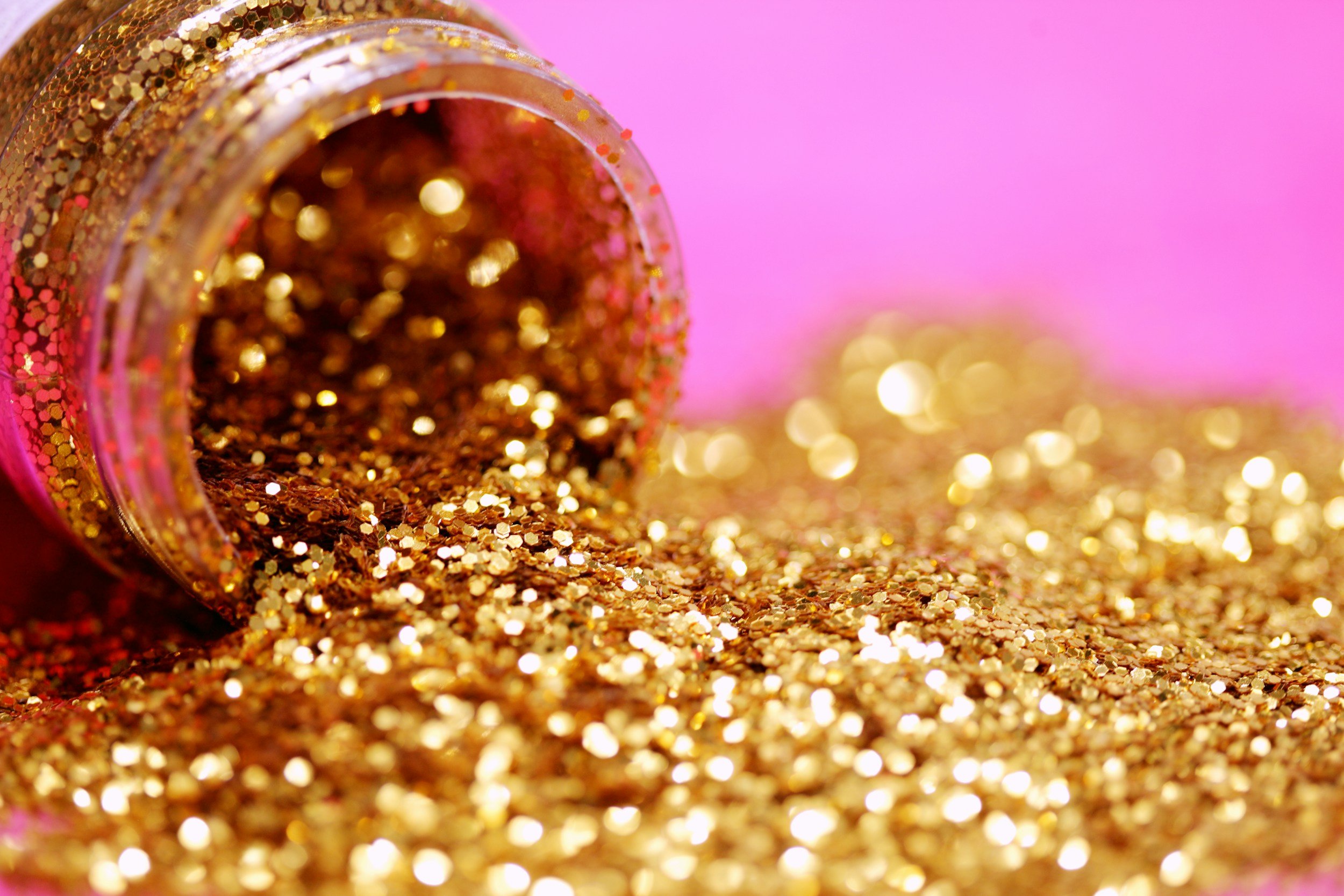
Reflective or Shiny Materials – Metallic colors, neons, or any shimmering shirts can be a distraction, and may interfere with lighting casting strange colours and patterns on your face. It’s best to avoid bold, shiny, shimmery patterns and textures
ON THE DAY CHECKLIST
Ensure everything you need to bring is packed, ironed and ready to bring into the studio. That you have your jewellery, shoes and any accessories you want to bring along with you. Please ensure your clothing is clean, pressed and hung on hangers.
PARKING
Street Parking. Studio is located behind the main residence. Either give us a call when you arrive on head straight back
WHAT TO BRING:
2-3 wardrobe changes (complete outfits including bottoms). Think diverse from semi-formal to casual
Don’t forget your undergarments and your shoes!
Lipstick/gloss for touch ups
Translucent powder
Hairbrush / comb for hair touchups
